Monday, November 29, 2010

Utopian Design: Volkswagen

When I think of a design that is designed for the people I think of Volkswagen. Now I know it sounds really odd but why not talk about another utopian design like the iPhone? Well because I think Volkswagen deserves a  spotlight as well.
Volkswagen Logo and history, from http://www.cartype.com/pages/1765/volkswagen

Volkswagen, or VW as known by its it iconic mark, is one of the world’s largest automobile manufacturers. That should already tell you that the Volkswagen design is made for the people if so many consumers are interested in buying such a product. Also added to the fact that when directly translated Volkswagen literally means people’s car in German.

The most interesting thing about Volkswagen is it’s history. The Volkswagen was originally designed by a Nazi trade union, called the German Labour Front in 1937. The German automobile industry was largely composed of luxury cars, and the people then could hardly afford the expensive models. With a new area to market in mind, the auto industry began to build the ultimate people’s car. Adolf Hitler has a hand in the creation of the Volkswagen, giving the basic guidelines for a Volkswagen car to be able to transport at least two adult and three children at a speed of 62 mph. Due to it’s mass production, the People’s Car, or VW would be able to sell to consumer for a cheap price.

Ferdinard Porsche (1875-1952), Image and history from http://people.westminstercollege.edu/staff/bknorr/html/history.htm

The creation of the Volkswagen was designed by the Engineer Ferdinand Porsche who made sure that the VW was fuel efficient, reliable, easy to use, and economically efficient to repair. While Erwin Komenda developed the recognizable body of the car known today as the Beetle.

Over the years Volkswagen had to create newer designs to market with the trend of society, from external to internal changes. With mass market cars, Volkswagen had an arrange of colors that a consumer can pick from and even customize detailing on their cars. On the other hand, over the years, the company has focused on creating fuel efficient models that aims to save gas and help improve the environment the best way it can. So far VW has developed many different hybrid vehicles like clean diesel, flexible fuel vehicles, and even electric cars and hybrids (so far they have discontinued ethanol vehicles). The aim of VW to go along with the times is to create a car that is both fuel efficient for society, accessible for everyone to use and attractive. Although, I purely believe that the attractive quality about the VW Beetle is in the ability to customize or pick out the car to best match the identity of the consumer. In this sense Volkswagen is every sense a utopian design, it is the People’s Car.

Here is a video of the Volkswagen Beetle design in 2010
http://www.youtube.com/watch?v=QsVcpk6Z8Qs

Dangerous Design

Earlier while discussing with a friend the idea of what is a dangerous design, she came up with the ideas of elevators. This was a new idea to me, since elevators are generally thought to be safe (although people with that phobia will disagree.)

I decided to humor her and set about to discover how dangerous elevator could be to humans and society. First, I believe that the most important thing to understand is that an elevator is a vertical transport that moves between floors. These elevators are usually powered by electric motors, cables, counterweight systems (like hydraulic fluids or pumps). The idea of elevators would generally be considered utopian since it is thought to help the handicap move about much more easily. I would agree until reading how its is only cables that holds a very heavy compartment up.

Now generally, elevators are safe, in fact it is considered one of the safest vehicle systems, so don’t let my own anxiety fool you. Generally if there is an elevator problem it is due to the door’s inability to open. Thus far, there are no cases of free-falling elevators that kill its occupants. Most of the deaths are maintenance related or other easily avoidable accidents.

This brief study on elevators made me realize that the design for elevators is not dangerous, its is the idea that people place in their own minds. To me it seems that people fear what they do not know, and since most people do not know that elevators are generally the safest vehicles of transport, they will continue to fear it. I was a little fearful at first knowing that all that holds me up from certain death is a bunch of cable wires, until I understood that  elevators are engineered to conform to a basic standard that must meet the basic requirements and safety standards of the US.

Thus this fear is purely unintentional, but instead perpetuated by movies in society that instill a sense of fear into its consumers by showing scenes of free-falling elevator compartments.

An example of such a movie is called The Shaft, a horror/thriller about a evil possess elevator

Color Transforms

Color is an essential instrument in a designer and artist’s tool box. The way color interacts with each other is a key component in making a design and masterpiece attractive and appealing to the eye. The way color interacts within a given space can produce a sense of balance for a piece of work, color can give the product a finished look and harmony.
Josef Alber's Book, Interaction of Color

In Josef Alber’s book, Interaction of Color, Alber takes on the challenge to explain the complexities of color, stressing the importance of balance in a composition of color. He illustrates the importance of each example with another illusions of color – how color behaviors in relation to other colors and shapes.

Example of a color wheel from http://www.realcolorwheel.com/tubecolors.htm

My most favorite illusion is the strange and captivating interaction between complimentary colors. Complimentary colors are pairs of colors that are opposite in hues in a color wheel. In color theory, complement colors are only truly complements if, when mixed together, they produce a neutral color, such as brown, gray, white or black. For purposes of art and design, the traditional set of complimentary pair colors are white and black, red and green, blue and orange, and yellow and violet. Thus, a complimentary color is usually a primary color paired with its secondary opposite.

The combination of complimentary colors in art and design is aesthetically appealing. The contrasting hues between red and green, blue and orange, and yellow and purple is attractive due to its bright warm tones juxtaposed against cool colors. Each of the complimentary colors pop out against each other, making one another appear much brighter, standing out as pure and bright colors. The contrast presents a balance of dark and light colors that is engaging to the viewer. In fact, because the colors are in high contrast the colors are especially stimulating when placed and designed correctly in an object, if not the process can be overdone and hard to look at, or ignored due to its lack of color.

Albers uses examples like complimentary colors to teach us that colors can work together harmoniously if the designer or artist presents their work in a logical and organized fashion. If so, color can be used to the designer's advantage to attract wanted attention. Thus, color is a equilibrium, too much color is over stimulating while too little is too bland.

Monday, November 15, 2010

Ergonomics Of An Object

Ergonomics is the study of human centered design, which basically means a study of everyday objects designed with people in mind. Now when doing ergonomics research this process can be applied to any object worth studying. The five areas of concern in ergonomics research is safety, comfort, ease of use, performances, and aesthetics.

So what is something we all use daily? Well I know what I use daily, besides this computer, my Blackberry Curve is quite possibly the most important thing to me. It is my connection to everyone inside and outside school, it is my connection to family, it is my alarm, my calendar, and my note taker, basically my cell phone could be my life (but its not, believe me I am not that obsessive…). Anyways, my Blackberry Curve can be a simple or complex device to use, but lets break it down to the five basic concerns of ergonomics.

“Safety first!” they always say (well who is they?). ANYWAYS, the safety of the Blackberry is creating a functioning mobile phone that is safe to use. For example, making sure that the battery doesn’t malfunction suddenly causing the phone to over heat, or making sure the charging port isn’t loose or built in such a way that would cause it to spark when connected with the electrical plug. Basically, what designers create and produce, they have to consider the safety issues. (Though to be honest, when I got my Blackberry it did all of these dangerous problems. Thank god for insurance!) Thankfully, my Blackberry Curve now is visually and currently very safe to use in my daily routines.

Second is comfort. I love my Blackberry Curve, especially because it is wide, it fits within the palm of my hand and the grips on the side are a velvety rubber and thus securing that grip. I love the wide screen on it because it allows more text to be easily read, and like most phones you can increase or decrease the size of the text allowing more comfort. The volume of the phone can always be adjusted of course, but I never had much of a problem with the sound, and it is generally very comfortable to talk on the phone for long hours. The compact size makes it a comfortable guest in your jean pockets. The Blackberry Curve is definitely made with the business consumer in mind, it has everything a business savvy person needs – a calendar, a notes program, a Word and PowerPoint program, an alarm, email and other entertainment needs like music, camera, video and games. Comfort for the businessman is a plus with the Blackberry Curve when everything can be placed within this small device.

Now with ease of use, after reading the instruction manual and playing around with the phone, my Blackberry Curve became pretty easy to use. It generally has the basic call and off buttons of every cell phone. However, calling and texting actually proved to be a struggle for people who have never used a Blackberry, several of my friends who have tried to mess around with my phone always needed some help to figure out how to call or send a text message – a definite downside, but a plus to help you realize who is playing around with your phone. The one that I love about my Blackberry Curve in particular has a QWERTY board, now if that does not says comfort I have no idea what does. The QWERTY board allows the comfort of a small keyboard built into your hand held. It just makes texting so much easier and faster.

Overall, the performance of my Blackberry Curve is on and off, like humans it has its good days and bad days (this is also probably due to my clumsiness, where dropping it a couple of time has probably slowed down its function). But for the most part my Blackberry Curve has been performing beyond average, after using it for two years I am proud to say that its performance is great and generally very reliable if you take pretty good care of it.

The aesthetics of the Blackberry Curve is sleek; my phone is outline in stone gray, generally promoting a sense of professionalism and cool. The design of the phone is very black, with the speaker at the top, the wide screen below it, the call and menu button after and the keyboard and the microphone at the bottom. The sides has buttons, the phone allows you to adjust the function of what the buttons do (such as adjusting volume or a quick short cut to your email). The port for the charger is generally well placed. Generally the Blackberry Curve is about a clean sleek design, perfect for every day use that elicits a mode of professionalism.

The Blackberry is perfect for any consumer, because of its function, its programs, and its design.


Blackberry Curve 8310 Review

Creative Motion: "Tips for Better Ideas"

One of my favorite hobbies is making creative videos. I mainly make videos like this one from Rethink Scholarship at Langara 2010. This video was a Call for entries, which was both inspiring and entertaining.

The video all about the mechanics of design, it called on its audience to think outside the box for creativity and inspiration, to do something extraordinary rather than ordinary.

For me, videos like this all have a message to convey and I believe that the ability to grab your attention and inspire someone to do something greater then what they did yesterday is admirable. I might be giving a lot of credit to this video, but I think a video like this is only successful if it makes you focus on the work you love the most, if it reminds you why you are doing what you are doing, and why doing it makes you fall in love with your work every day. It reminds me of the very basic principle I have learned in design so far: DO WHAT YOU LOVE.

I believe that this video was cleverly designed. It was in a sense the most basic and most simplistic it can be. A video in a slightly fast-forwarded speed, however the content is what spoke to me – the creators of the video had made a book from a hardbound sketchbook. Then they made it into something that was interactive! Each page that they flipped to was something new and innovative, it called on artists to use their creativity to design something worthwhile, to be inspired and to stand out.

This video basically gave advice on how every artist and designer should work out THEIR design/creative process. It asked everyone to have their own ideas, to trust your guts i.e. have confidence, to think of a thousand ideas not just one, to speak out, to think of everything i.e. to think up every problem with your idea and find a solution, to never repeat, to get feedback, to leave an impression on your audience, and most importantly to keep on going. The video was ultimately encouraging and the music was pretty good as well but… this is just something you HAVE to watch.


&

Monday, November 8, 2010

Words and Images: Part 2 COMICS


Today, I was perusing through a copy of the California Aggie a newspaper produced by my school at the University of California, Davis. Where by chance I took a glance at the tiny comics section where I was met with a little two panel comic strip that illustrate perfectly how words and images need to be well balance in order for things like comics to work.

Comic strip, NAMES, found at xkcd.com

The comic is simplicity at its more basic form, line drawing. The characters are stick figures and the clothes on the characters are there to indicate status, position or gender.

The comic is actually a focus on the male character’s frame of thought as he stands as a groom next to his bride. In one panel is a close up of his dilemma, where he has forgotten his soon to be wife’s name. In the next scene, the comic book artist has zoomed out, giving the viewer the entire view of him at his wedding with his bride next to him and a preacher just about to announce his wife’s name. As soon as the preacher recites her name, a thought bubble stemming from his figure appears and exclaims “Aha! Rachel!” while this was not the most elegant comic, or even humorous, it does show that words and images have to work together to make some sense. If there were no words, the two-panel scene would be all together meaningless. If it were only words, we would not see too much humor, only a cruel joke. The comic together gives the joke a lighthearted experience not to be taken too lightly.

Read more comics here.

Words and Images: Brian Fies


Last week, Tuesday November 2, 2010, our design class had a wonderful guest lecturer by the name of Brain Fies, a comic book artist for renowned works like Mom’s Cancer and Whatever Happened to the World of Tomorrow?
Book over to Mom's Cancer

He gave us a specific lecture on his creative process, or how he went about creating his two books, thus the color schemes, the layouts, the design, and most importantly the idea. The inspiration for his two books came from his life experiences and his interests. He heavily emphasized that he could have easily wrote a book about his experience especially when going through his family crisis with Mom’s Cancer, but he chose comics.

Why?

Because he had always loved comics, he felt fascinated how words and images worked well together to complete the idea. Words and images gave the story more impact, it made his story more profound, the images were sympathetic and it echoed in his story. One would not survive with out the other. It was an equal balance, the image called on the words to explain what images alone could have not and vice versa.
Excerpt from Mom's Cancer

I believe Brian Fies really showed us the beauty of comics, I have never found comics interesting until he explained his interest in it. Now that I look at it in a different light I can see the beauty in which image and words are juxtapose together create an existence of time. Comics brought life into his mom’s journey and battle with cancer. His comics beautifully stretch or condense time through panels, a skill I have come to admire in comics. In this one strip, Fies illustrate a passage of time through his mom’s struggle with lung cancer in which she makes a commentary on her addiction to cigarettes, while she goes through her chemotherapy treatments. Fies used selective quotes from his mom’s arguments with herself and images at each process to show exactly what his mother was thinking. If words had only been used, there would not have been much of an impact. Seeing the chemotherapy eat away at this woman, along with juxtaposing words made me feel sorrow, anger, and a multitude of emotions as she dealt with her chemotherapy and abstinence from cigarettes.
Brian Fies and his Family

Check out Brian Fies at his own Blogspot!


Arik Levy's Preliminaries: Dick, Pussy, and Ass Exhibition.


A friend on Facebook posted an interesting design article I came across this weekend, the article was about a design concept in which geometric shapes were symbolic shapes for sexual organs.

The controversial idea is a three-part collection of three cabinets called Dick, Pussy, and Ass by French Designer Arik Levy. The artist states that the stylized geometric furniture boxes can be rearranged to make statements about sexual organs.
Dick, Pussy and Ass by Arik Levy

Each cabinet is made of black-waxed MDF (medium-density fiberboard) and colored with different accents for each piece. For instance, Dick is accented with gray, Pussy with red accents and Ass with yellow accents.

The entire exhibition is called Preliminaries.

Levy comments that the controversy is that the symbolic images are considered inappropriate in society, but he wants to emphasize that these shapes are beautiful. These 3 part pieces can all communicate with each other through rearrangement. For instance, Pussy can be considered loose or tight by the distance for which it is placed. Dick can be considered erect or not based on whether it is up or down, while Ass can communicate with either piece by placing it by any of the sexual organs.

The fact that these sexual organs are reduced to geometric shapes, Levy says, is that it reduced the issue of "vulgarity and obscenity."

Personally, if I had not read the title of the article I would have merely thought these geometric shapes were just badly arranged and that the Ass piece looked a lot like a star, but you tell me!


Monday, November 1, 2010

Mass Produced Objects: Movies and CDs

One thing my Art History: Photography in History class has taught me so far is that photography is easily reproduced and if photography is so easily distributed then films are too. Movies are quite possibly the easiest to reproduce, distribute, in a variety of ways. They industrially massed produced with the same contents, a CD and a plastic boxed case that protects said contents, and a strip of paper that illustrates the front with the title of the product and the summary in the back.

In many ways FILM itself is mass-produced, it is made FOR the people, it is made with people in MIND. The storyline itself it is always targeted at a group of people and its function is easy enough: to be your entertainment. Movies are very much a part of design; the commercials are cut to capture the consumer’s attention and each scene sets out to deliver the product (plotline).


The CD the movie finds itself encoded on, the box that contains it, and the wrapping is the physical industrially mass produced product. The function of this package is universal so that everyone can enjoy it. The product function is the same no matter where you go. The shape of the CD and the Box is generally the same, built for easily storage, protection, and organization. The CD and box are formed from two of the most basic shapes in the world the circle and the square.

The circular shape of the CD allows the ease to transmit information and designers have kept this traditional shape due to the cheap cost. I believe that this is the reason since it is easier, safer and longer lasting to carry information on a USB drive but it is easier to store it on a CD still since much of technology still use the CD to transmit information.

The box, itself, is just as universal since its main function is to protect the CD from breaking or gaining scratches. Even the thinner paper casings are used in the same basic way and function.

Thus, the film industry itself is an industrially mass produced object. It is an easily distributed object that can be passed and utilized worldwide. So in fact the CD is generally a very modern function that will not seem to be outmoded anytime soon.

How Form and Content Interact in Objectified


Objectified is a 75-minute documentary film by Gary Hustwit in 2009. The documentary explains how form and content interact together within design. It emphasizes how the object’s function and design to complete that goal is important to the object. In fact, the aesthetics of an object comes almost near to last sometimes.

In fact, the only company that has ever satisfied all points of design is the Apple Company, according to the documentary. Their modern innovations are functional and aesthetically pleasing.

The film displays how designers try to answer the BIG questions of design such as what is design, who are the people of design and especially what is the role of design in our society? They showed interviews asking designers to explain their process to creating a product that is functional, easy to use and aesthetically pleasing. In order, for a design to be successful function has to be above form. If the design just looks good but fails to convey its function then the product has failed to achieve success.

Designers MUST obsess over the goal to fit people’s needs and desires. They must improve the product or create something FOR the consumer.

The film follows the three phases of modern design, which demonstrates the relationship between form and content.

First, the formal relationship or formal logic that gives form to a traditionally accepted object. Form should easily show the object’s function.
Second is the symbolism of the content is which the form is influenced by society and culture. Third is the design-contextualized sense of technology that seeks to satisfy the relationship between human and object. This last step seeks to find a way in which the designers must seek to answer the big questions such as a away to make the product easily recyclable.

Objectified demonstrates how form and content should always work together to create an easily accessible product. To quote a line from the documentary, “Good design is aesthetic, innovative, honest, unobtrusive, consistent, long-lived, useful, in detail, environmentally friendly, and have as little design as possible.”


LOGORAMA!

OH MY GOD. I apologize I could not contain my excitement but this is quite possibly the most epic short film ever made and quite possibly every single graphic designer's dream world to be living in. OKAY. Okay... you got me I must be exaggerating but truly this is one entertaining short film! So give me a chance to explain myself here.

Well first off, what film am I talking about? LOGORAMA! A short 16 minute film directed and created by a French collective called H5 that was presented at the Cannes Film Festival in 2009, they opened for the Sundance Film Festival in 2010 and also won Best Short Animated Film. H5 is a small graphics and animation company in France.

The short animation depicts a story that takes place in Los Angeles utilizing over 2,500 logos and mascots to tell its story (Can you even imagine the amount of time they had to spend JUST to avoid violating patents on these Logos and Mascots?) The film makes comments on how deeply logos are embedded into our culture and it presents a commercialized universal that is both real and fantastical.

The first few seconds into the film is already awesome, the scene spans a shot over Los Angeles using logos to set as buildings. People as Aim icons, birds from the Bentley logo and butterflies from Microsoft. The story revolves around Michelin Man Cops in a cruiser, a Pringle man propositioning s Esso Girl waitress and some kids on a zoo tour lead around by a flamboyant Mr. Clean. The Cops soon are called on a chase for a loose criminal which turns out to be Ronald McDonald. A thrilling gun battle ensues and then…

Alright well I told you enough, now if seeing Ronald McDonald as the villain doesn’t interest you I don’t know what will. Enjoy it.


Check out the full 16 minute film, Logorama!

Monday, October 18, 2010

Comparison and Contrast


Lately, I’ve been comparing the processes of silk screening and graphic design due to the fact that I am currently taking both Design 1 and Chicano 73 (the silk screening class). Having these two classes juxtaposed back to back against each other, I have begun to see their correlating factors and values.

To me, the outcome or the product is the same. As a silkscreen artist and someone aspiring to be a graphic designer, we must first plan our layout. The placement of information such as graphics and text are all equally important in silk screening and graphic design. We both convey the same information but how we get to finish makes us different.
Milton Glaser, Psychedelic, 1983

Both the silkscreen artist and the graphic designer must finish design a plan. A layout for their product, then they must split the design into layers. Each layer is basically another plan, a layout of a specific color. However, while the graphic design can design their layout on a computer program and sort them out accordingly. The silk screener must design their layouts manually using exacto knives, ink pens, acetate, ruby lift, and other expensive products.

Malaquias Montoya, Vietnam Aztlan, 1973

I believe that learning two of the processes is equally important. One teaches the basics and importance of traditionally done work, it demonstrates the time, effort, and patience the silk screener must work to create a semi-limited print. While the other is a new-age technology that is generally quicker but applies the same basic principles of silk screening.

These two classes illustrate my reasoning in picking my two majors art studio and design because I believe in the importance of learning both traditional and modernistic ways of producing art.

Sunday, October 17, 2010

Gestalt's Psychology


Gestalt is a German term that means the essence of shape of an entity’s complete form, or in simpler terms, a set regarded as a whole.

In design, we learned about the Gestalt effect in which our senses will create forms in respect to visual recognition and fill in whole forms instead of focusing on a small area of lines, curves, or shapes.

We specifically learned that, Gestalt Theory, was about three things.

1. Understanding perception as a process of pattern making ie. The organization of patterns and the meaning of recognition.
2. Perception is self-organizing.
3. Spontaneous drive towards spontaneity.

In other words, gestalt in design is about figuring out the big picture.

But then I remember my mentor once telling me about this artist, J.C. Leyendecker who illustrated figures in which their limbs and heads were depicted clearly while their bodies blended into the background.
Art work by J.C. Leyendecker

This concept is similar to the Gestalt Theory since while only the limbs and head appear, our visual recognition forces us to imagine the rest of the body. Making the rest body appear to us despite the lack of imagery. This unique concept demonstrates to us that we need little to create.

Thus, in this unique way we were able to get to the picture by making use of what we know already.


Design As A Conversation

Design As A Conversation

We define conversation as a verbal or nonverbal exchange; it is an interaction between people or people and things. A conversation can be about the act of sharing information or discussion. A conversation can be about learning from one another by “talking”.

And people do talk.

But that is how we share information; we hear it through the “grapevine.” We gossip, we argue and we engage with one another. We converse and that is how we share information. The Internet only provides another form of communication, a faster form, which spreads news like wildfire. For instance, Facebook’s ever changing design allows pretty much anyone who post information to be stalked on the newsfeed. As each new layout is introduced to the accepting and conforming masses, we are acquainted with new ways to discover information about our friends and family members. (Unless you utilize the block tool.)

Which brings us to the issue of design.

Design as a conversation, to be more specific – As an artist: we use, create, format, arrange things unknowingly to create a piece that would “talk” to our audience. We try to create things that would make them stop and think. We try to make people say “Wow” because that “wow” will make them pause and consider the message we are trying to convey.

Objects in design are similar in that they want to convey their message nonverbally. Instead of talking, the audience must understand exactly what the object is trying to “say”.

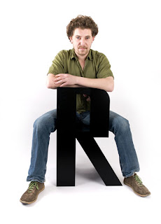
For example, Graphic designer Roeland Otten made something called “communicative seating” in which he created a prototype of alphabet chairs and stools from lacquered MDF. The general idea for the chairs was to be able to create words by arranging letters while at the same time the pieces were able to function as comfortable seating.

Thus, the conversation between the audience/buyer and the alphabet chairs would be the ability to actually arrange a “conversation” by arranging the chairs. Also, the consumer would have to deduce that these creative alphabet blocks are indeed chairs. Letter chairs, in fact, letter chairs that you can sit on. How amazing is that?

These typographic chairs can be bought exclusively letter-by-letter, allowing the consumerist to create whatever word they should like.

So not only did Roeland Otten make his chairs functional, but he designed them to be educational as well. Using a very simple construct such as the 26 letters of the alphabet impose on the function of a chair, his letter chairs can converse with the consumer in many ways.

Monday, October 11, 2010

Creativity From Without


As with any artist or designer, there are times where it is necessary to take inspiration from the natural world. It is important to learn to draw from experience and very important to utilize one’s emotions felt in the moment. It is important to seize the opportunity to express one’s idea, whether through basic sketching or using raw materials around for a simplistic depiction of that idea. Even using a camera to expose a detail about life never noticed before is a genuinely new simplistic idea, one that conveys using nature to inspire.

One artist that I have been learning about lately from two of my current classes this quarter is Karl Blossfeldt. A photographer that took up close up shots of plants, these magnified shots changed perspectives in the way people looked at plants. In design, we examined his work as a way of seeing designs in the way plants grow, how they have design forms in the way the vines twisted and curved. How natural forms can depict common design forms, demonstrating exactly how designers and artists can learn from nature if they take the time to notice the way nature designs itself in raw materials.

Karl Blossfeldt (1865-1932)

Where as in my art history photography class, we talked about Karl Blossfeldt, as an artist who saw the beauty in natural forms. How the natural form appears to be an imitation of people and due to the way the shapes of the plant embodies humans, he shows us our deeper connection to nature.


Karl Blossfeldt, Pumpkin Tendrils Magnified 4x, 1928

The intriguing idea of plants seen through a magnified view was interesting from the art and design point of view. While design and art both examined form, they both saw and understood something different through the pictures he took. Design saw concepts, and art seek a deeper meaning in the close up forms.

Karl Blossfeldt, Unknown

The idea that a picture can stir up several different meanings without explanation from the artist brings up the concept that art should be freely interpreted. I believe that is the true meaning of art, that art should be allowed to be interpreted by anyone without knowing the artist’s true intention.

Stone Soup


An interesting activity I participated in last Tuesday, October 5, 2010, was an activity called Stone Soup. This activity was based upon the story called Stone Soup, which was a tale about hungry soldiers that would eat people out of house and home when they took lodgings there. Eventually, the townspeople became afraid of these ravenous soldiers and decided to deny them food. Cleverly, these soldiers designed a way to get everyone in the village to give them some food. They asked for a stone and a pot of water to cook the delicious stone soup, during the preparation they begged each villager if they could give them one ingredient that they had to spare (whether it was a carrot, potatoes, I think you get the idea!). As people began to throw in one ingredient each into the pot, the soup began to smell and taste delicious. Eventually the soup was completed and everyone was able to enjoy stone soup.

While our activity for Stone Soup did not involve food, it was cleverly devised for beginning design students to learn to create, communicate, and have fun by using only the items we brought to class. The plan was to get us to enjoy our work, by not having to think about having a deeper message to our design. It was also to get us to participate in a rare activity that exercised our creativity and test our ability to accept the product of our work.

At the beginning of Stone Soup, we were off to a rough start. No one had an idea as to where to began. I and a few others offered ideas to get us started and without any plans (or drawings) we got to work. Through evolution, trial and failure, we eventually developed an idea that took form by accident.

Process of Stone Soup

As we began to mold our creation an interesting abstracted representation of human beings that began to take shape. Individual ideas were blended into the creation such as adding small details like clothing or facial expressions that gave our stuffed beings life.

Results!

I believed that the lesson learned here was design is sometimes about using the bare materials that you have, understanding the challenges and restrictions, overcoming them by teamwork, appreciating individual ideas, communication, and most importantly having fun.

Signed an amused artist,
Caroline

Friday, October 8, 2010

Design: Verb, Noun, or Both. Oh my!


Design is like a double threat when defined. To answer the question, “Is design a verb or a noun?” Well to me? It is both.

Design is a verb because it can be something that you’re doing. To design is to create a plan. It is the action of creating, as in the moment of doing design.

On the other hand, design is very much like a noun as it can refer to the item designed, the plan, or the idea. Hence, the noun definition of design refers to the plan or the steps taken to build your “idea”.

Thus, design is a very fluid term, because design is about everything and with such wide specifications there is no wonder that design is both a noun and a verb.

In Design 1, we decided to decipher and pick apart the roots of the word. The etymology of design can be derived from either its Latin roots or its Greek roots.

The Latin root of design was signare, which means, “to mark” or the action of mark making. Or in other words it means to sign, as in to sign or make your mark.

Where as in Greek, the root word for design means “approximately” which is interesting because we would believe that design would have to be exactly complete not incomplete. Professor Housefield mentioned that the Greek word for design meant trying to capture the invisible idea. Trying to complete an idea of an object that is in the process of becoming.

And finally from the Italian language, the word design is truly formed from the word disegno in which is it believed that Leon Battista Alberti who wrote the book Alberti, On Painting (1435), who brought the idea of design in to being.

Leon Battista Alberti, On Painting (1435) 

So now that I’ve defined my definition of design and explained its etymology from what I’ve learned in class. What is your opinion of the word design? Is it a noun, a verb, or both?

Thanks for joining me on this educational PSA,
Caroline

Monday, October 4, 2010

GPS>Options>Points Of Interest


Recently, we were asked to read Michael Bierut’s online article “Warning: May contain Non Design Content” (August 31, 2006) posted on The Design Observer.

The article was interesting in that it contained nothing about design hence the title. However, the most important emphasis the article made to me was that if you are asked to design, create, or make something, you should ONLY do the project if you are absolutely interested in it.

I whole-heartedly agree with this idea.

I have discovered that important lesson in my art classes. When there was a prompt that had little to do with my interest, even after research, inspiration would escape my reach.

However, whenever I was given the opportunity to create something I was truly interested in, I found myself filled with passion for my work and I believe that the intensity of that passion can be seen and felt as a result. For example, my favorite pieces of art were paintings done in my beginning painting class because the professor gave us the opportunity to create whatever we wanted.

Bierut, too, had realized that his best work always involved subjects and issues that he felt completely involved; especially subjects he was interested in learning about and/or subjects he was currently passionate about.

As a counter point, Bierut demonstrated through his own life example that it was possible to create something that you knew little or had no interest in and perhaps even be proud of your work at the end. However, when he eventually was able to learn about the work after the project, he realized his design, his creation for the issue was completely wrong.

Thus, it is always possible to create something. To produce some work or piece that is a reflection of skills. However, in order to create good work or great work, I feel that it is always necessary to have that interest.

Thus, find an interest, but always “be ready for anything.” – Michael Bierut

Signed an inquiring mind,
Caroline

Sunday, October 3, 2010

Lion King: I just can't wait to be king.


As an art and design student, my first interest with both began with film.

Television was one of the few constants in my early developmental years. (Not to say that people weren’t a part of it either, but film is generally all around.) My first recollection of the first movie I ever remember seeing was The Lion King. The movie was filled with bright colors and tones, unique shapes and scenery, and a masterful composition and design. It was inspiring to see a story come to life based on drawings and conceptual design.

The Lion King, 1994 - Disney

So I believe that an important element along with communication is the creative design of color and function, the ability to know how color can work and relate to the images in the scene – and how they can be representative of form and shape.

Because it is film, it relies mostly on your vision and hearing. Lion King, for me, was about catchy tunes and vibrant colors. It was about the personable characters and how the scene was always moving along, thus keeping you entertained. And how can it not? Film is something you have to give your full attention to in order to learn from it.

However, the compositional design of the film showed me a world outside the city suburban life. It depicted a scene of the savannah, which allowed the audience to imagine utilizing their other senses such as touch, smell and even taste.

Touch: in relation to the lion’s fur coat, the intricately drawn grass, and all other scenes that depicted transitory ideas like water. While it is drawn depiction, we all know how water feels in our hands, so we can thus imagine how it flows.

Smell: is similar to transitory ideas like water. Even as a child, we all have recollections of certain smells, which is why I won’t go into details about why all the animals wouldn’t even stand downwind of Pumba.

Taste: this issue is a little more difficult but the most memorable scene is the bug-eating scene. Frankly, we all don’t really to imagine it. It’s just sort of disgusting.
Timon from The Lion King, 1994 - Disney

So how does this relate to design? As I grew, I began taking a look at behind the scenes clips that showed how the movie was made. These clips emphasized the creating animated films using digital and traditional based concepts demonstrating the importance of mastering both mediums.

Thus, my first movie became my inspiration for my majors. Go figure.

Signed a “maturing” artist,
Caroline